offset-path | CSS-Tricks
The offset-path property in CSS defines a movement path for an element to follow during animation.
This property began life as motion-path. This, and all other related motion-* properties, are being renamed offset-* in the spec. We’re changing the names here in the almanac. If you want to use it right now, probably best to use both syntaxes.
Here’s an example using the SVG path syntax:
.thing-that-moves {
/* “Old” syntax. Available in Blink browsers as of ~October 2015 */
motion-path: path(“M 5 5 m -4, 0 a 4,4 0 1,0 8,0 a 4,4 0 1,0 -8,0”);
/* Currently spec’d syntax. Should be in stable Chrome as of ~December 2016 */
offset-path: path(“M 5 5 m -4, 0 a 4,4 0 1,0 8,0 a 4,4 0 1,0 -8,0”);
}
This property cannot be animated, rather it defines the path for animation. We use the offset-path property to create the animation. Here’s a simple example of animating motion-offset with a @keyframes animation:
.thing-that-moves {
offset-path: path(‘M 5 5 m -4, 0 a 4,4 0 1,0 8,0 a 4,4 0 1,0 -8,0’);
animation: move 3s linear infinite;
}
@keyframes move {
100% {
motion-offset: 100%; /* Old */
offset-distance: 100%; /* New */
}
}
CodePen Embed Fallback
In this demo, the orange circle is being animated along the offset-path we set in CSS. We actually drew that path in SVG with the exact same path() data, but that’s not necessary to get the motion.
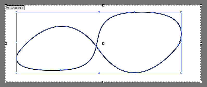
Say we drew a funky path like this in some SVG editing software:
We would find a path like:
The d attribute value is what we’re after, and we can move it straight to CSS and use it as the offset-path:
CodePen Embed Fallback
Note the unitless values in the path syntax. If you’re applying the CSS to an element within SVG, those coordinate values will use the coordinate system set up within that SVG’s viewBox. If you’re applying the motion to some other HTML element, those values will be pixels.
Also note we used a graphic of a finger pointing to show how the element is automatically rotated so it kinda faces forward. You can control that with offset-rotate:
.mover {
offset-rotate: auto; /* default, faces forward */
offset-rotate: reverse; /* faces backward */
offset-rotate: 30deg; /* set angle */
offset-rotate: auto 30deg; /* combine auto behavior with a set rotation */
}
Values
As best as we can tell, path() and none are the only working values for offset-path.
The offset-path property is supposed to accept all the following values.
- path(): Specifies a path in the SVG coordinates syntax
- shape(): Creates a path with CSS-y commands instead of SVG
- url(): References the ID of an SVG element to be used as a movement path
- none: Specifies no offset path at all
- Shape functions: A set of CSS functions that specify a shape in accordance to the CSS Shapes specification, which includes:
Here’s some tests:
CodePen Embed Fallback
Even telling an SVG element to reference a path definied the same SVG via url() doesn’t seem to work.
With the Web Animations API
Dan Wilson explored some of this in Future Use: CSS Motion Paths. You have access to all this same stuff in JavaScript through the Web Animations API. For example, say you’ve defined a offset-path in CSS, you can still control the animation through JavaScript:
CodePen Embed Fallback
More Examples
Heads up! A lot of these were created before the change from motion-* naming to offset-*. Should be pretty easy to fix them if you’re so inclined.
CodePen Embed Fallback
CodePen Embed Fallback
CodePen Embed Fallback
CodePen Embed Fallback
CodePen Embed Fallback
CodePen Embed Fallback
CodePen Embed Fallback
Browser support
Is There Another Way to Do This?
Our own Sarah Drasner wrote about SMIL, SVG’s native method for animations, and how animateMotion is used to animate objects along a SVG path. It looks like:
GreenSock is another way though. Sarah talks about this in GSAP + SVG for Power Users: Motion Along A Path (SVG not required). Example:
CodePen Embed Fallback
Almanac
on
Sep 5, 2011
clip-path
.element { clip: rect(110px, 160px, 170px, 60px); }
Almanac
on
May 4, 2018
offset-anchor
.element { offset-anchor: right top; }
Almanac
on
Jul 22, 2016
offset-distance
.element { offset-distance: 50%; }
Almanac
on
offset-rotate
.element { offset-rotate: 30deg; }
Almanac
on
Jul 9, 2025
circle()
.shape { clip-path: circle(100px); }
Almanac
on
ellipse()
.shape { clip-path: ellipse(60px 40px); }
Almanac
on
Jul 15, 2025
inset()
.element { clip-path: inset(10px 2em 30% 3vw); }
Almanac
on
Jun 18, 2025
path()
.element { clip-path: path(“…”); }
Almanac
on
Jul 24, 2025
polygon()
.element { clip-path: polygon(50% 0%, 75% 6.7%, 93.3% 25%, 100% 50%, 93.3% 75%, 75% 93.3%, 50% 100%, 25% 93.3%, 6.7% 75%, 0% 50%, 6.7% 25%, 25% 6.7%); }
Almanac
on
Jun 10, 2025
shape()
.triangle { clip-path: shape(from 50% 0%, line by 50% 100%, hline to 0%, line to 50% 0%, close); }
Almanac
on
Aug 14, 2025
url()
.element { background-image: url(” }
Almanac
on
Jul 15, 2025
xywh()
.element { clip-path: xywh(60px 4em 50% 10vw round 10px 30px); }