At Deccan Herald, AI turns articles into instant infographics
The answer was not to change the story itself, but to build a tool that could generate structured, visual summaries directly within the CMS.
To aid with that, Deccan Herald joined the 2025 edition of Newsroom AI Catalyst, a WAN-IFRA accelerator programme in partnership with OpenAI that supports news publishers with their strategic AI initiatives.
Founded in 1948, Deccan Herald is part of The Printers (Mysore) Private Limited, which publishes both Deccan Herald (English) and Prajavani (Kannada). Together, they have a strong presence in the southern state of Karnataka and a growing digital audience. Its coverage spans politics, business, civic issues, and culture, with increasing emphasis on digital formats and audience engagement.
The problem: limited time, limited bandwidth
The starting point for what would become an AI-powered infographic tool was a dual constraint: on the audience side and also within the newsroom. In response, the team developed a way to generate structured, visual summaries directly in the publishing workflow.
Users often arrive with limited time, making it less likely that they will read through full articles. At the same time, creating alternative formats manually required additional effort that editorial teams could not always accommodate.
Before the tool, summarising or structuring content meant extra work after the article was completed.
“If editorial teams had to make summaries or structured content, they would have to spend time after the article was created to think of the best way to create bullets or summary of the article,” said Suhas Bhandari, Product Manager, Deccan Herald.
Why this and why now
The decision to prioritise the tool was driven by both audience behaviour and internal constraints.
“I would say audience needs and editorial bandwidth constraints,” Bhandari said. “Users want easily consumable points and might not want to go through full paragraphs.”
Without an alternative format, these users were more likely to drop off. “So instead of these users usually bouncing off, the idea is to engage them with content that is suited for their tastes.”
The goal, then, was to introduce a format that could coexist with the full article, serving as an entry point rather than a replacement.
What they built: a CMS-integrated infographic tool
The result was a CMS-integrated infographic generator – referred to internally as the “CMS Infographic Creator” – that allows editors to create visual summaries with a single action. The tool is being used across publications within the group, including both English and Kannada newsrooms.
The goal was not just speed, but scale: turning what was once a roughly 10-minute manual task into a one-minute review step.
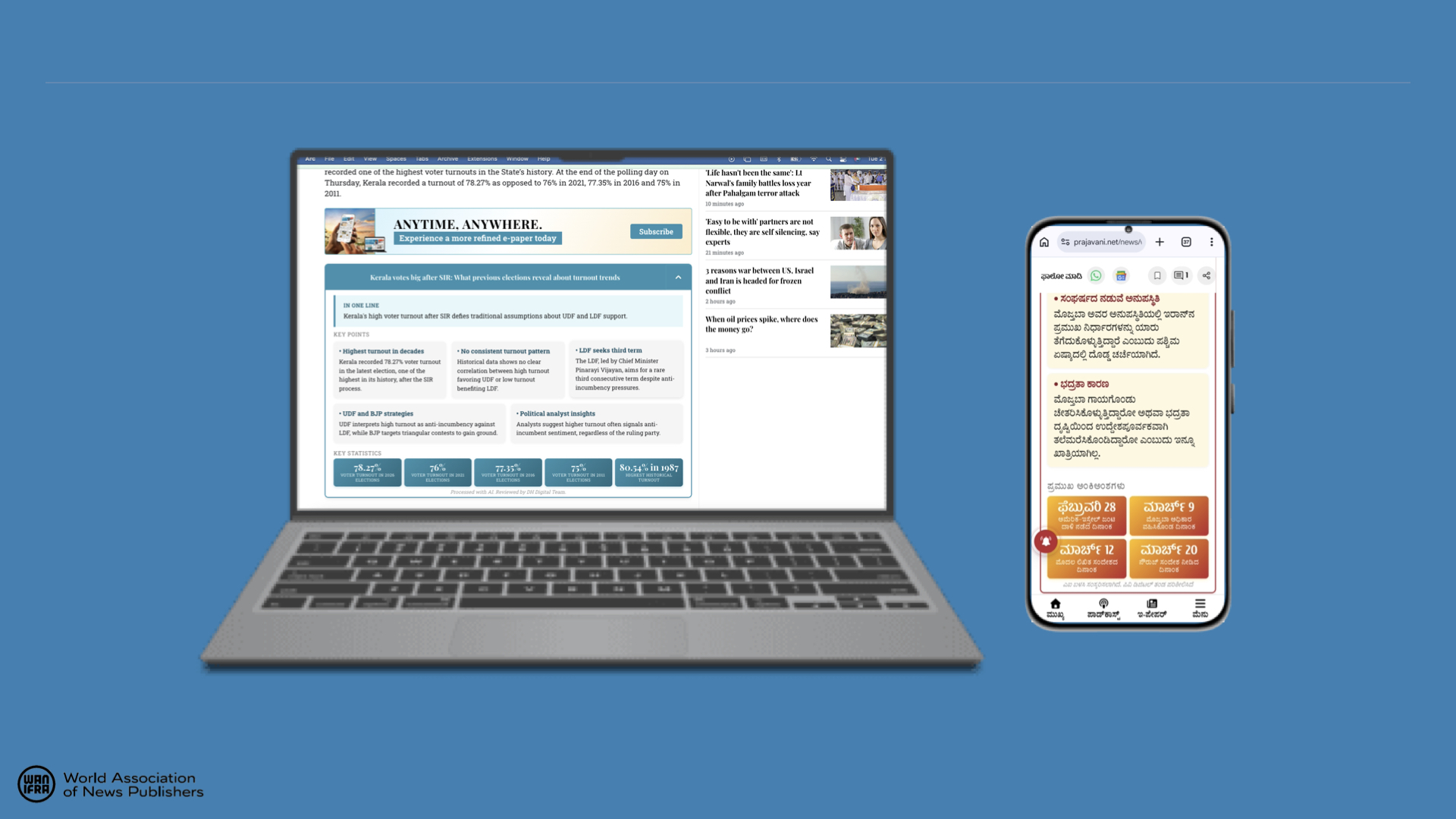
The infographics tool at work on Prajavani.
“It’s simple,” Bhandari said. “The user finalises the article with the hero image and the content. Once that’s done, they click on a button on the CMS embedded through the extension called ‘Create Infographic’.”
The output includes key points extracted from the article and structured into predefined HTML templates. Editors can review and edit the content before publishing, or regenerate it if needed.
“If the content needs edits, they can be made in the preview. If not, then it’s already copied to clipboard for the editorial team to paste it in the CMS embed box,” he said.
Implementation: from prototype to workflow integration
The tool evolved through iterative development rather than a single build.
It was initially conceived as a one-shot HTML generator, but this approach proved inefficient. Generating full HTML structures increased token costs and reduced reliability.
The team shifted to using pre-designed templates, with AI limited to populating key variables, improving both consistency and cost control.
The extension itself was built with limited engineering bandwidth. “The extension itself was built using AI without bandwidth from the tech team,” Bhandari noted, highlighting a more experimental, product-led development approach.
Over roughly four months, the tool moved from prototype to a production-ready CMS feature, with increased editorial interest prompting further refinement.
Impact: early signals and adoption
The tool is still in its early stages of adoption, with usage currently limited.
“It’s too early to estimate this since it’s not being used at scale yet,” Bhandari said. At present, “only about 5 percent of articles have the infographics inserted within them,” with editorial teams deciding where to apply the feature.
As a result, the focus is on tracking directional indicators rather than outcomes. These include how often infographics are added to articles, how many users view them, and whether readers interact with them by expanding the content.
While engagement impact is still being assessed, the tool has already reduced the effort required to create structured summaries, shifting the task from manual formatting to quick review and editing.
The efficiency gains are significant. “Ordinarily, if the team had to create this themselves from scratch, it would take about 10 minutes. With the tool, editing takes only about a minute,” Bhandari said – reducing the task from content creation to quick review.
The Infographics tool at work on DH English
Lessons learned: structure, control and flexibility
One of the key learnings was around how much of the output should be generated by AI.
Asking the model to generate full HTML structures proved costly and less reliable. By contrast, using fixed templates with AI-generated content inserted into defined fields delivered more consistent results.
Another insight was the importance of editorial control. Even with automated summaries, small adjustments were often necessary to ensure accuracy and tone. As a result, the system was designed to keep editors in the loop at every stage.
“The editorial team reviews and edits every AI-created infographic,” Bhandari said. “And they also control the prompts for the AI. This ensures full accuracy.”
Finally, the team found that visual summaries work best as complements to full articles rather than substitutes, offering an additional entry point for readers with different needs.
What’s next
The next phase will focus on scaling usage and refining the tool based on real-world performance.
This includes analysing engagement differences between articles with and without infographic embeds, and identifying which story types benefit most from the format.
The format varies by story type. “General stories use bullet points, how-to pieces use numbering, timelines map time and events, and comparisons are structured side by side,” Bhandari said.
In practice, most output defaults to bullet-point summaries, reflecting the newsroom’s core coverage. “We have observed that explainer articles are most suited for this infographic,” he added.
There are also plans to expand functionality within the CMS extension to allow editors to generate infographics more flexibly using existing templates.
At the same time, the team is refining how summaries are generated, particularly for more complex or sensitive stories.
Beyond article embeds, the tool has already enabled adjacent use cases. “Once the infographic creation system was created, we got the idea to also use the same content in social media posts as carousels,” Bhandari said.
This has since expanded into other structured formats such as visual stories and listicles, opening up new workflows for social distribution.
As the system evolves, the focus remains on reducing friction for both readers and editors, making it easier to extract and present key points without adding to the newsroom’s workload.